/char.
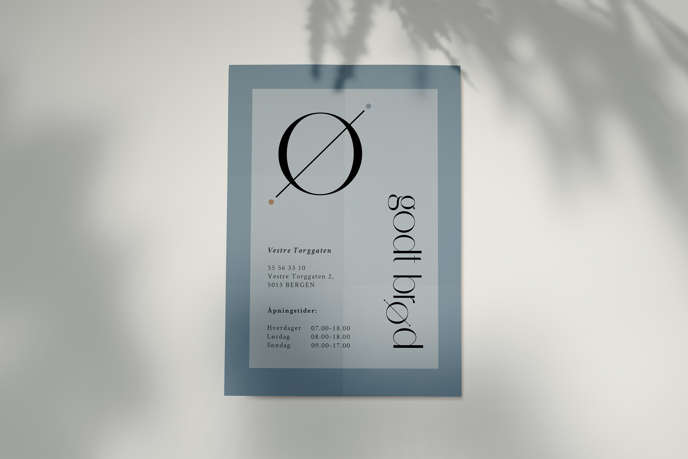
godt brød bakery
×


This project is my personal take on a brand refresh for Godt Brødt, a long-established bakery in Bergen, Norway. For the revamp, I aim to showcase a modern and more sophisicated feel by using a classic sans-serif typeface for the logo and a muted colour palette. To add movement to the logo, I saw an opportunity to play with the “ø” in a way that connects to baking - I came up with an abstract element of a thin rolling pin and the “o” as the dough. The overall design is inspired by contemporary Scandinavian bakeries, nordic colour palettes and wooden bakeware.