/char.
sukin naturals
×


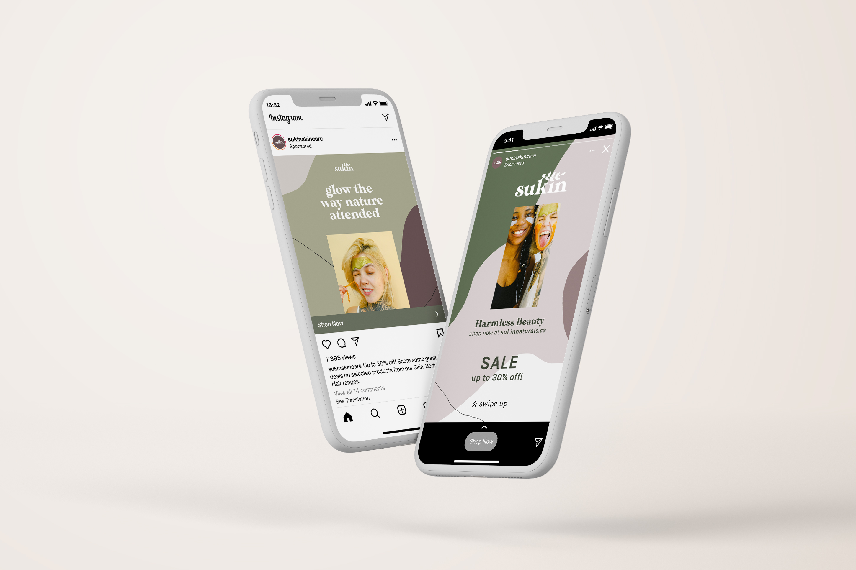
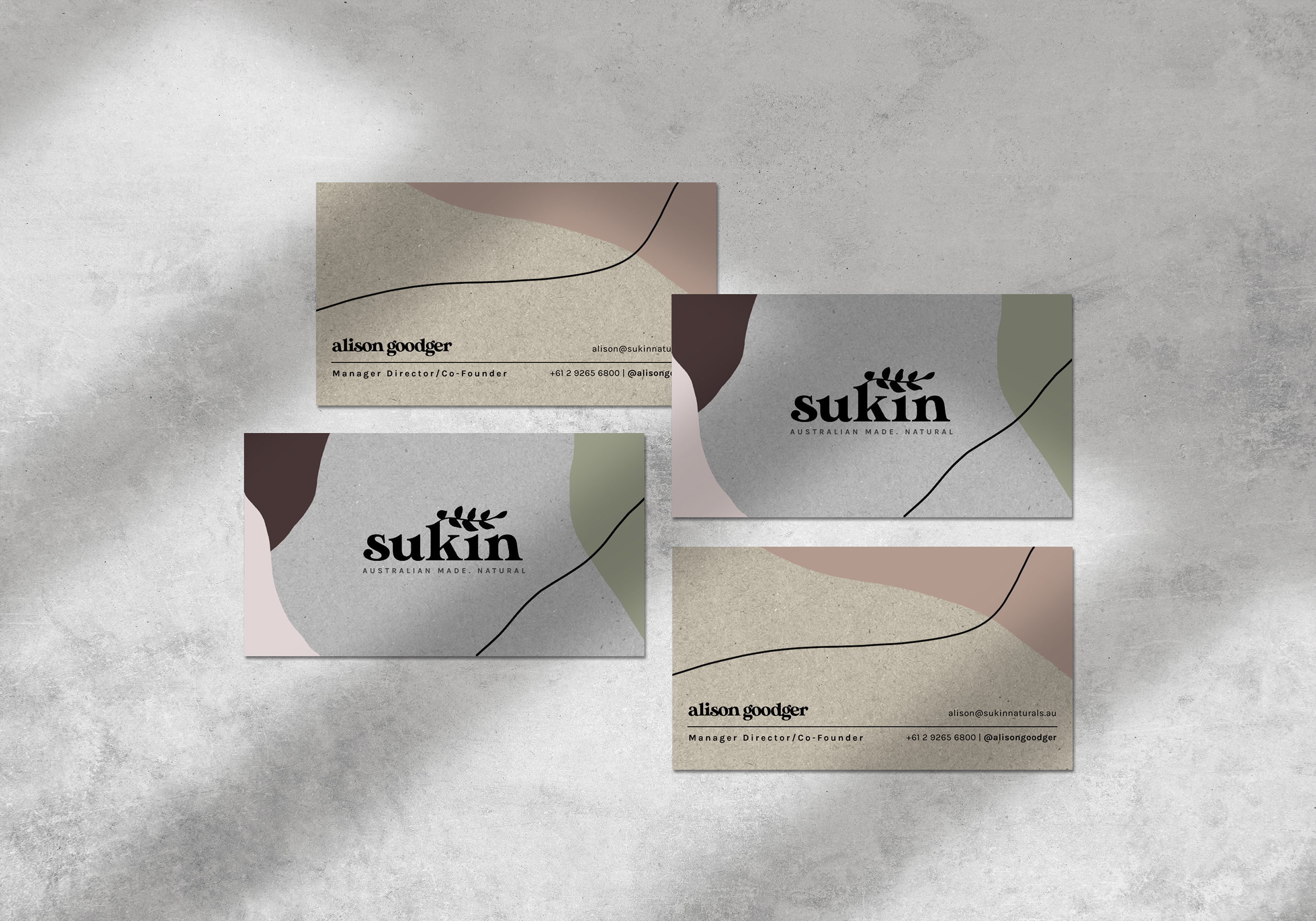
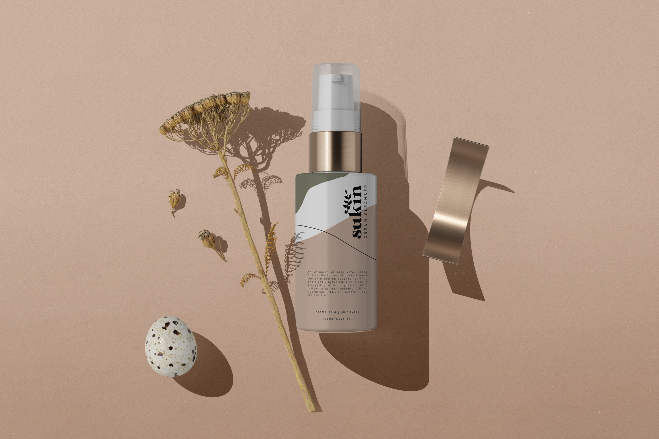
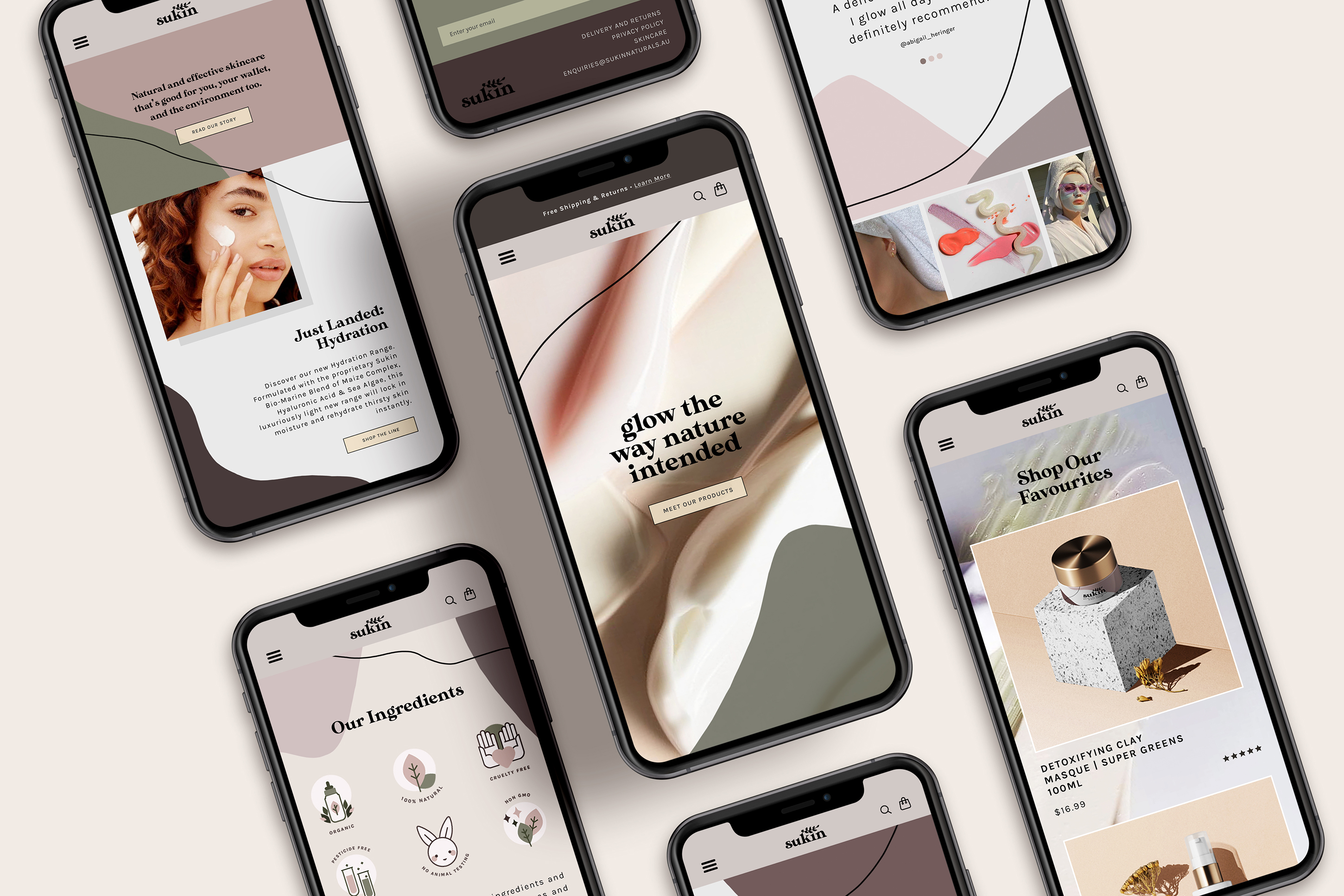
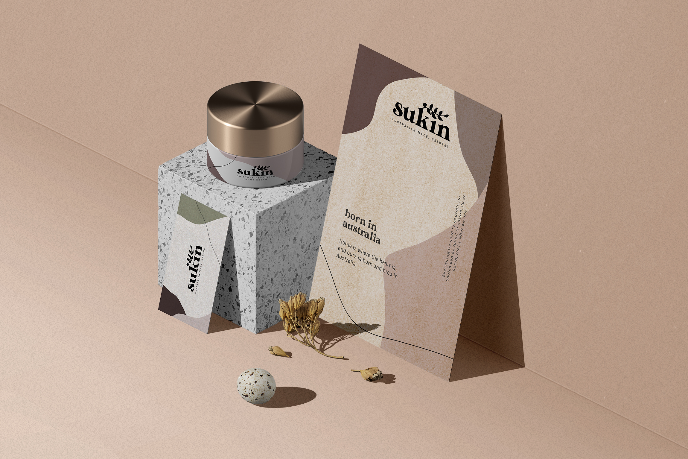
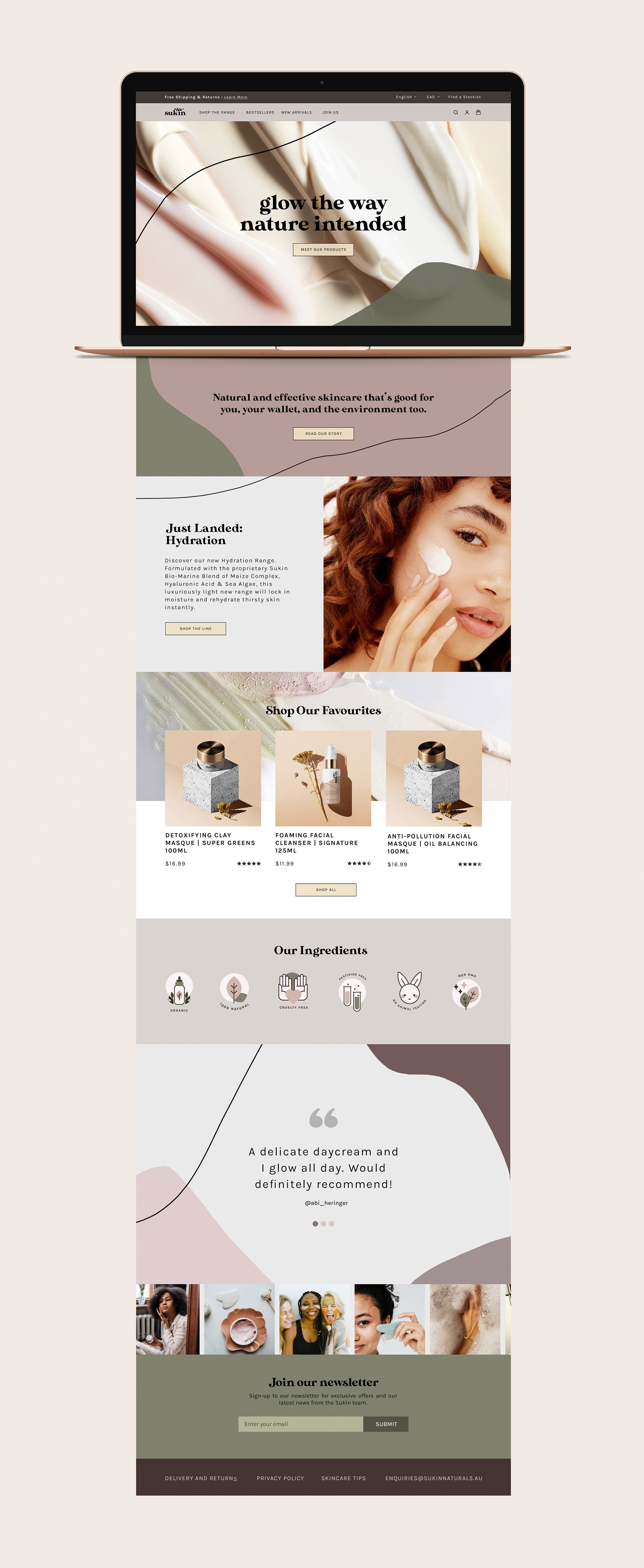
This project is a refresh on the classic Sukin Naturals logo and branding. It was a fun personal project to work on because I’ve used their products for years and always thought they needed a fresh, new look. Since Sukin’s target market are women aged 20-30 who are active on social media, I took major inspiration from trendy cult-favourite beauty brands for the revamp. I wanted to maintain Sukin’s down-to-earth identity but still capture value through delicate, natural colours and minimal text to give the brand a fun and youthful flair.